Did you see the Aurora Borealis?
It’s been one of my dreams to see the Northern Lights some day so when there was a spectacular Aurora Borealis visible here in Victoria recently and I didn’t see it I was gutted.
But it did remind me that I’d been wanting to try out the Northern Lights technique for a looooong time. So why not now?
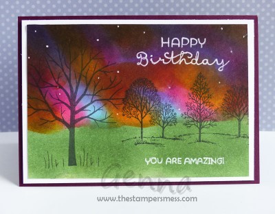
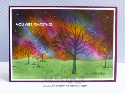
This technique is all done with sponging. I used a combination of Sponge Daubers and Stampin’ Sponges for my tools. I masked off the bottom portion with a torn piece of scrap paper and just played around until I got a look I liked – I did go through quite a few sheets of cardstock though! The colours I used for the sky were Crushed Curry, Melon Mambo, Tempting Turquoise, Pumpkin Pie, Blackberry Bliss and Black.
Once I was happy I sponged some Garden Green ink for the ground and stamped the silhouette trees over the top. I used a combination of Sheltering Tree and the ever reliable Lovely As A Tree.
Finally I added the greetings and the stars. The latter were dotted around using the tip of the White Gel Pen and really made a huge difference to the look of the sky.
After all the sponging attempts that didn’t make the cut I ended up making two cards. I like the ‘lights’ better on one and the layout better on the other.
Which one do you like best?
Leave me a comment and let me know!
Do you want to know a secret?
I stamped the greetings in Whisper White ink but didn’t like how pale they seemed on the background, so I held my breath and traced over the stamping with the White Gel Pen.
In future I think I’ll use White Embossing Powder and emboss over the top.
Don’t forget to let me know which version your prefer.
Cheers
Genna
 Follow






Hi Genna, Thanks for the call tonight. I will try my utmost to make your launch – at this stage I’m thinking possibly Friday. I will see if I can ‘drag’ a friend, if she does not have a better offcer! I love both of your cards and the colours – would like to that one day! As far as to which one I like best or better ….. I like the way the colours are in the first card but prefer the layout of the second! However, like I said before, I love them both! I also like your ‘little’ trick! : 😛 🙂